Tavare · 6-month contract · Norway
Making mending the easier option than buying new.
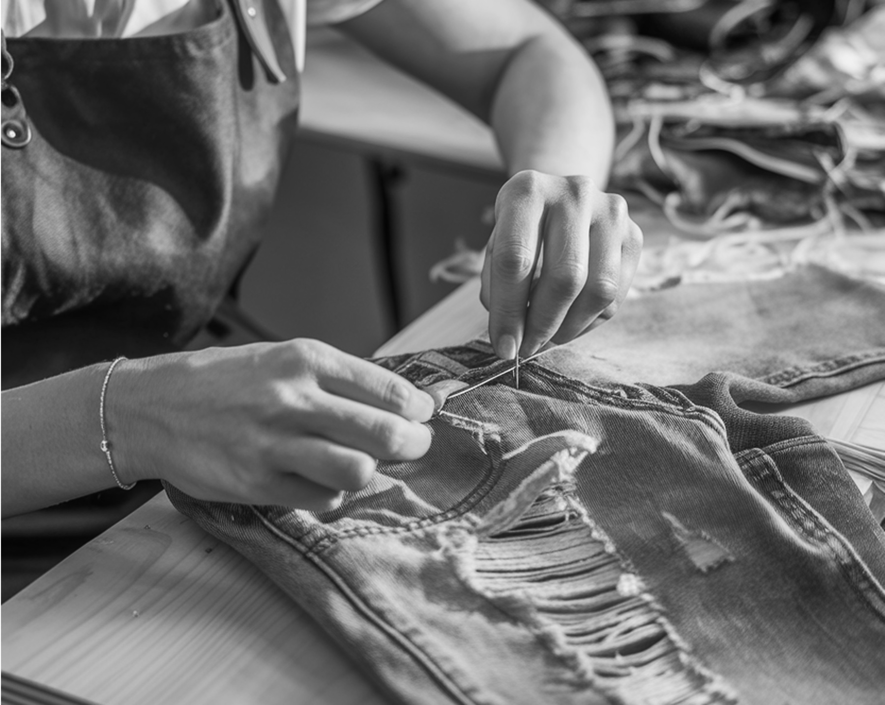
Tavare collects damaged clothing, sends it to a partner tailor and brings it back repaired, for individual customers and for fashion brands like Levi's and Tommy Hilfiger.
01 · The universe
One repair order, four businesses to keep happy.
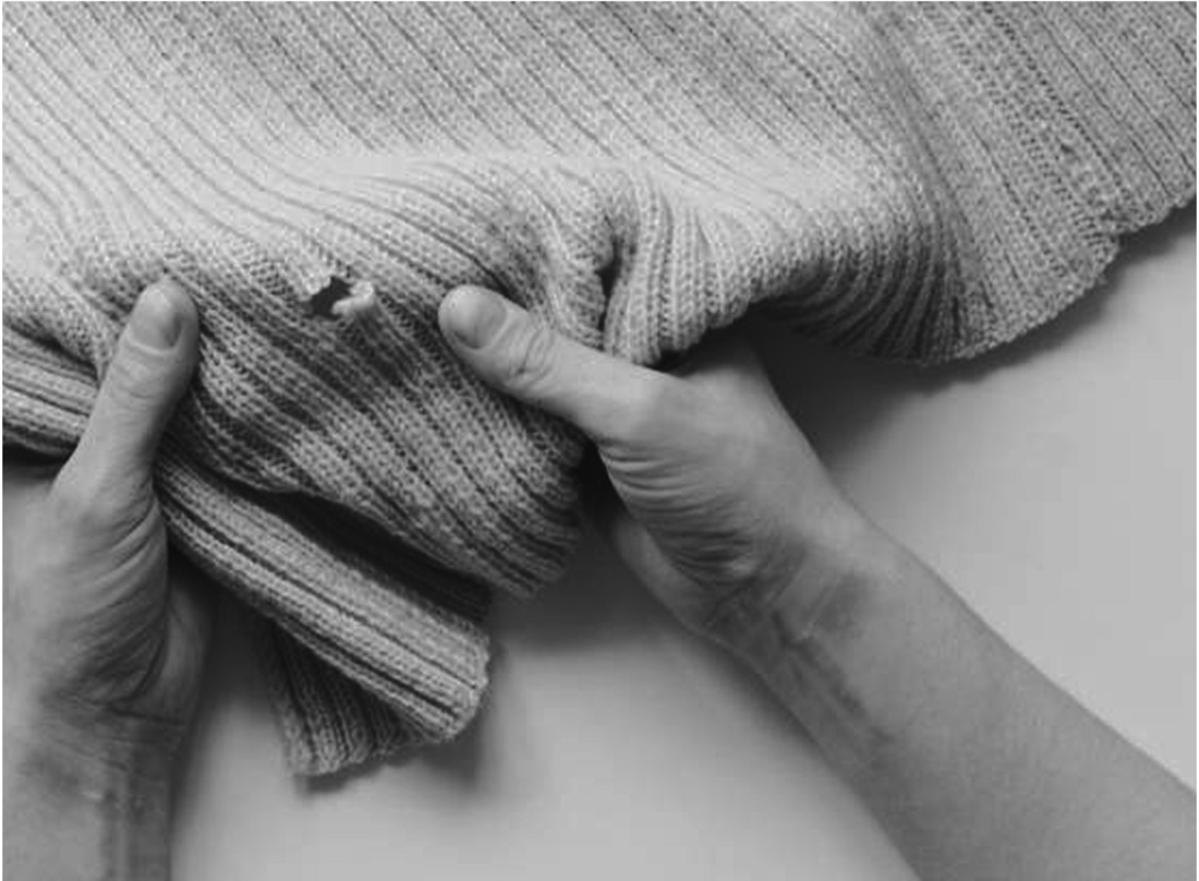
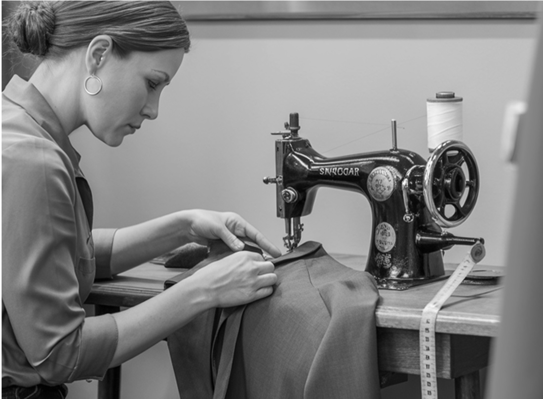
Tavare collects damaged clothing, sends it to a partner tailor and brings it back repaired. Individual customers and fashion brands like Levi's and Tommy Hilfiger both send work through the same pipeline.
one pipeline
02 · The one big problem
Norwegians want to repair. Replacing is just easier.
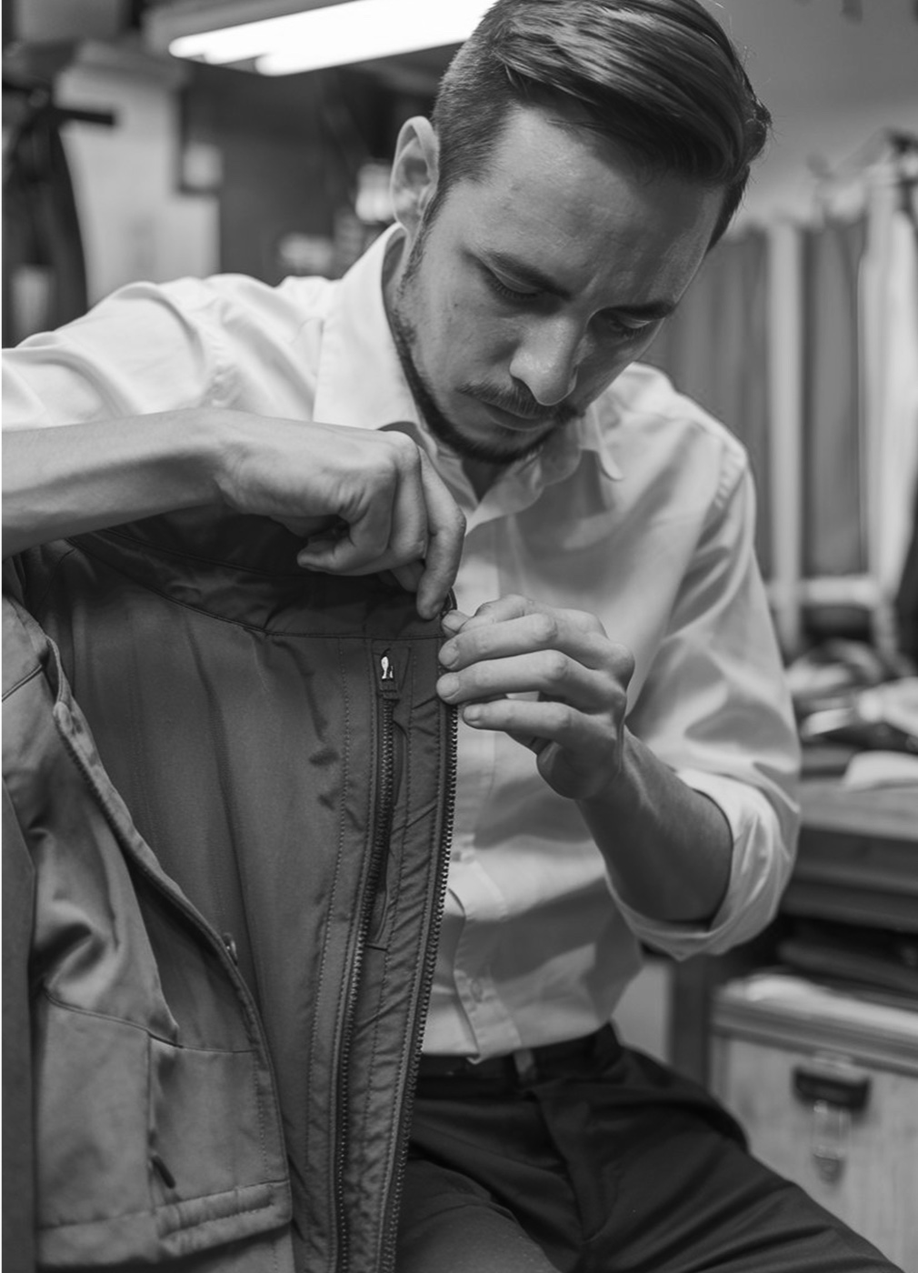
Finding a tailor you trust, getting there, and paying close to the price of new is enough friction to send a torn jacket to the bin.

And what made it hard to design
- A three-sided marketCustomers, tailors and brands each need a different tool, but all of them work on one order.
- Two demand streamsA single shirt and a brand's bulk consignment go through one pipeline without it splitting in two.
- Price parity with newRepair only wins if the cost is visible before the customer commits.
- Trust while the garment is awayOnce the jacket is gone, every surprise charge reads as a hostage note.
- Four surfaces, one modelKept coherent while the business model shifted underneath.
03 · The user
Three people who would repair, for three incompatible reasons.
Interviews traced what happens when something breaks.
“If someone handled the whole repair for me, I'd actually do it.”
Designed for: fewest steps, doorstep pickup.
“I want to repair instead of buying new, but I need to trust it.”
Designed for: status at every handoff.
“I'll repair if it makes sense, not if it costs more than new.”
Designed for: a price on every tile.
04 · Market & benchmarking
Five competitors. Nobody connected all three sides.
Consumer players owned convenience but had no channel to brands. B2B players owned the workflow but had nothing a customer would ever touch. The gap was the part that connects them.
 Borrowed: a premium feel tied to brands people recognise.
 Borrowed: repairs that are predictable and priced up front.
 Borrowed: trust through a curated set of makers.
 Borrowed: B2B coordination and operational insight.
 Borrowed: circular, reuse-first community behaviour.
Brand-tied premiumClear, priced repairReuse communityCurated makersB2B repair ops05 · The starting point
The existing repair flow began with paperwork.
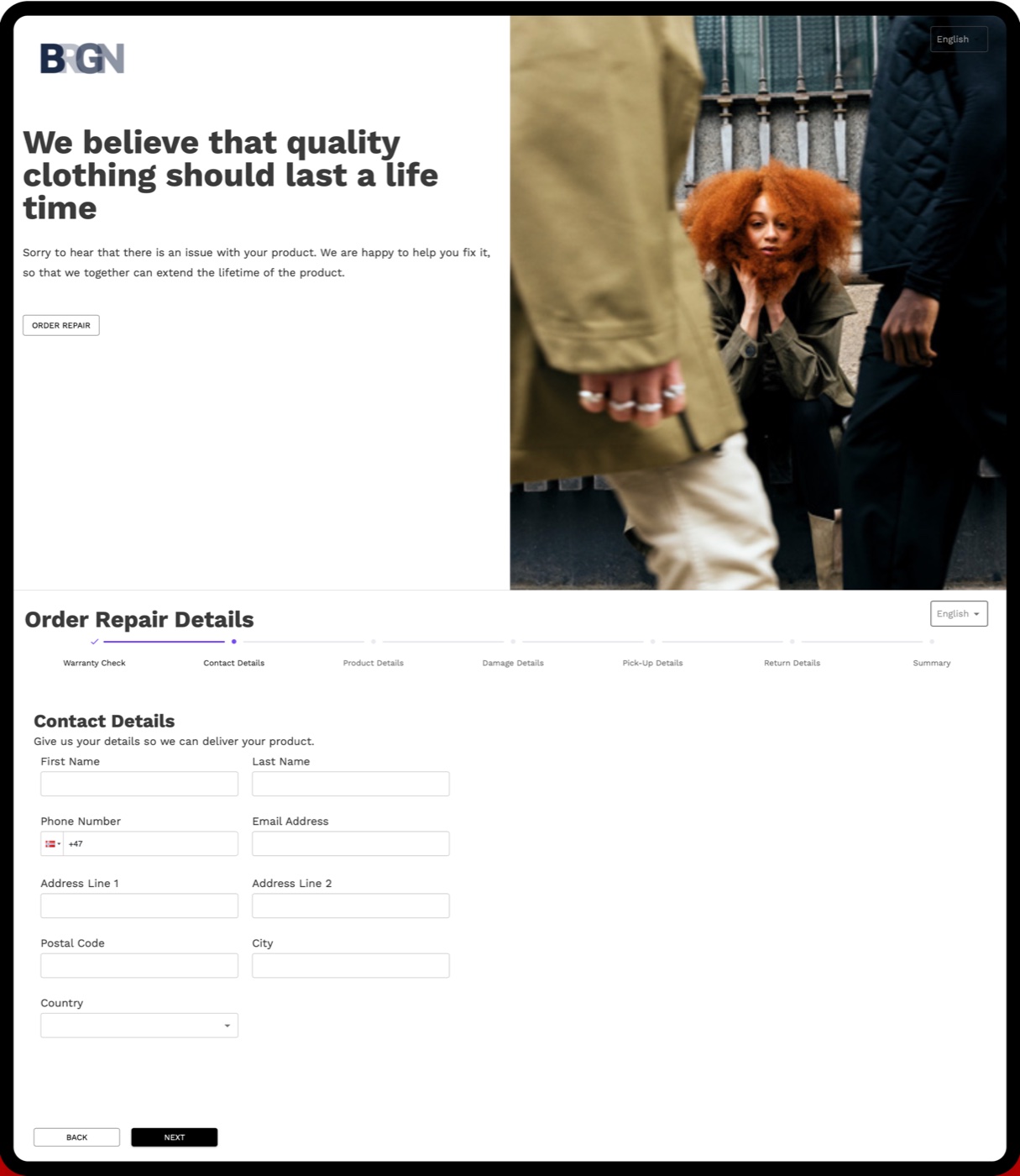
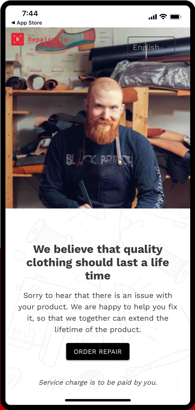
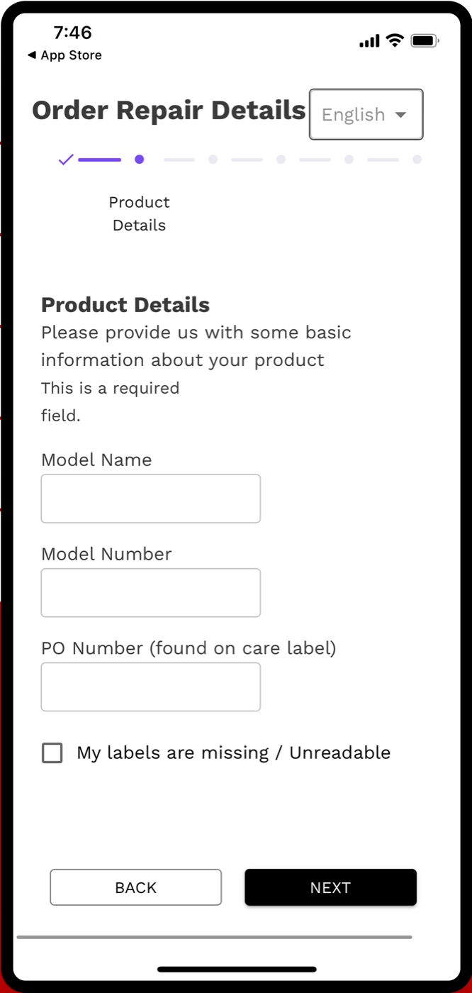
Before any new design, I audited the interface brands were already sending customers to. It worked, technically. It just asked the customer to do the triage.
- The one action is the smallest thing on the page. "Order repair" is a thin outline button beside a full-bleed photo.
- Seven steps, and damage comes fourth. Warranty check, contact, product, damage, pick-up, return, summary.
- Controls sit on the photo. The logo and the language switch fight the image for legibility.
- A cost with no number. "Service charge is to be paid by you", and no price anywhere.
- It asks for what people don't have. Model and PO numbers off the care label, before anyone describes the tear.
10 · The solution
One pipeline, four doorways into it.
Every surface reads and writes the same order. Each one is shaped by who holds it and where they're standing.
11 · Customer app · entry
People arrive holding something broken. Don't make them register.
- Vipps first
- Around 99% of Norwegians already log into apps with Vipps, so the hardest screen became one tap.
- a conveyor belt
- If it's email, it's two short screens: address, then name and phone. Email and birthday are optional, and an address is saved once as Home, Work or Friends & Family.
- spend the space on value
- What a long form would have taken went to the offer: discounts, round-the-clock support and a six-month warranty on every order.


12 · Customer app · intent to repair
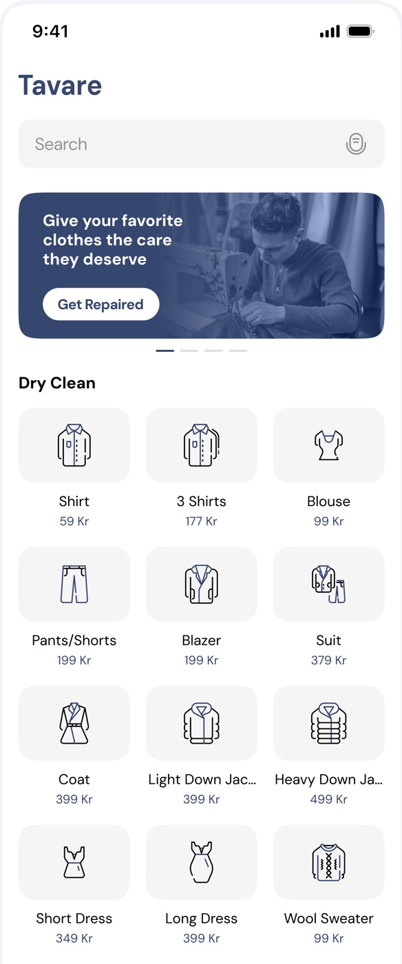
The catalogue is the home screen.
Interviews and affinity mapping agreed on one thing: people open the app to get something fixed. So nothing sits between Home and a placed order.
- catalogue
- The price is on the tile, not behind a step. That answers the cost-sensitive customer's question before they ask it.
- quantity
- No product pages. Tapping a tile turns it into a stepper in place, and a bar keeps count until you open the cart.
- checkout
- One sheet: items, a prompt to mention stains, the membership offer, delivery and payment, in reading order.


13 · Membership
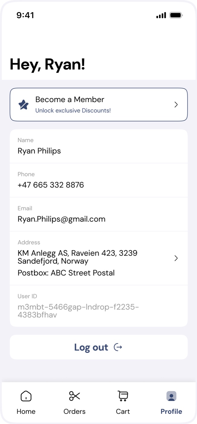
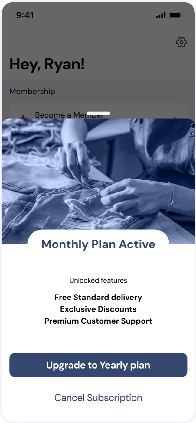
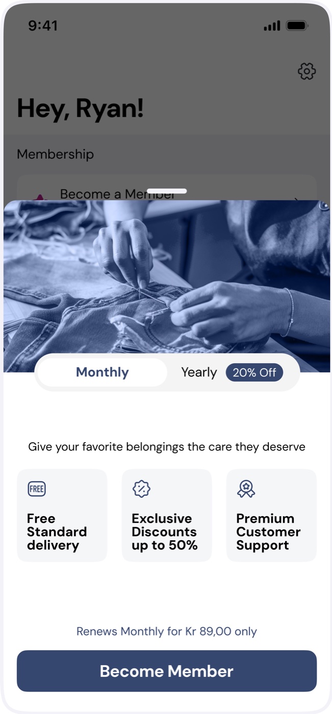
Membership pays for the service. I let users settle the explainer.
Revenue depended on getting customers subscribed, so how the offer was explained mattered more than how it looked.
- A/B test the explainers instead of picking one in review. I ran several variants to take subjective opinion out of it and learn how people actually scan an offer.
- One quiet entry point. "Become a member" is a single row at the top of Profile, and a one-line offer inside the cart, never a pop-up.
14 · The hardest moment
The repair nobody agreed to.
A tailor finds more damage once the jacket is already with us. The customer can't see the garment and is being asked for more money.
- Interrupt with one fully specified question: what was found, on which garment, what each fix costs.
- Make refusal a first-class option. Skip sits beside Pay, and the original repair continues either way.
- It follows the customer until it's answered, on Home and on the order in the list.


15 · Delivery & logistics
Payment isn't the end. The next physical step is.
Several logistics partners sat behind one checkout. The design had to nudge the right one, then make sure the clothes actually left the house.
- ranked choice
- Three handover options, not a list of equals. Express, home pickup and parcel locker, each with cost and duration on one line.
- confirmation
- "Order placed" shows the next step, with the locker address and a map pin.
- follow-through
- Until the clothes are dropped off, tracking marks the handover as pending.


16 · Customer web
Nobody installs an app to fix one shirt.
Brand partnerships send customers in from a retailer's link: open it, fill one form, get it fixed.
- Web is a direct copy of the app's components, not a sibling design. Same tiles, steppers and damage taxonomy.
- One build, two jobs. The same flow runs dry cleaning with an article picker, and scales from phone to desktop.


17 · Repair capture
Design the failure state first.
A photo was the fastest way to describe damage, and the likeliest thing to fail. Each state says what's happening and what to do next.
- The photo stays in view while it's scanned, and the button itself becomes the progress.
- Failure is said plainly, in red, with two ways forward: enter details, or re-upload.


- IdentifiedDamage confirmed, on to checkout
18 · Retail dashboard
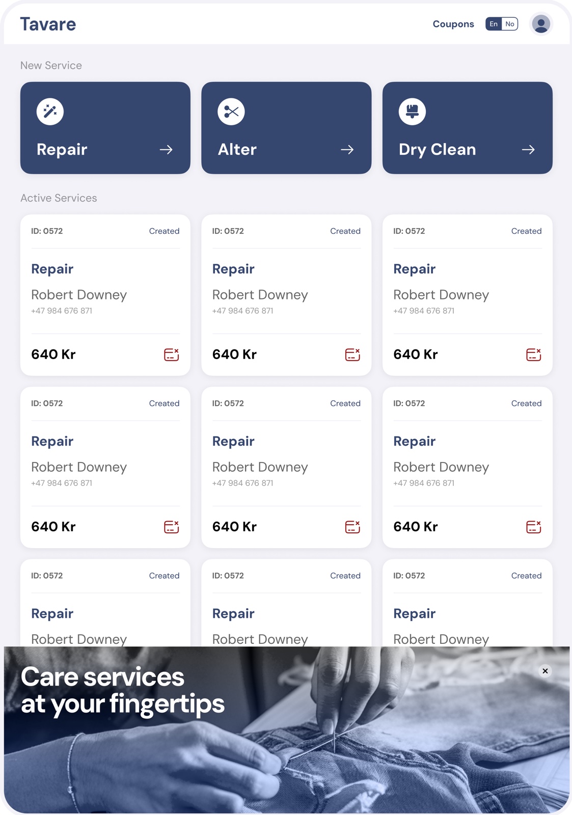
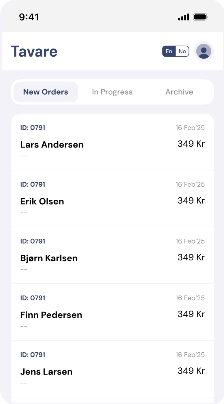
Retail staff are on their feet. So it's an iPad.
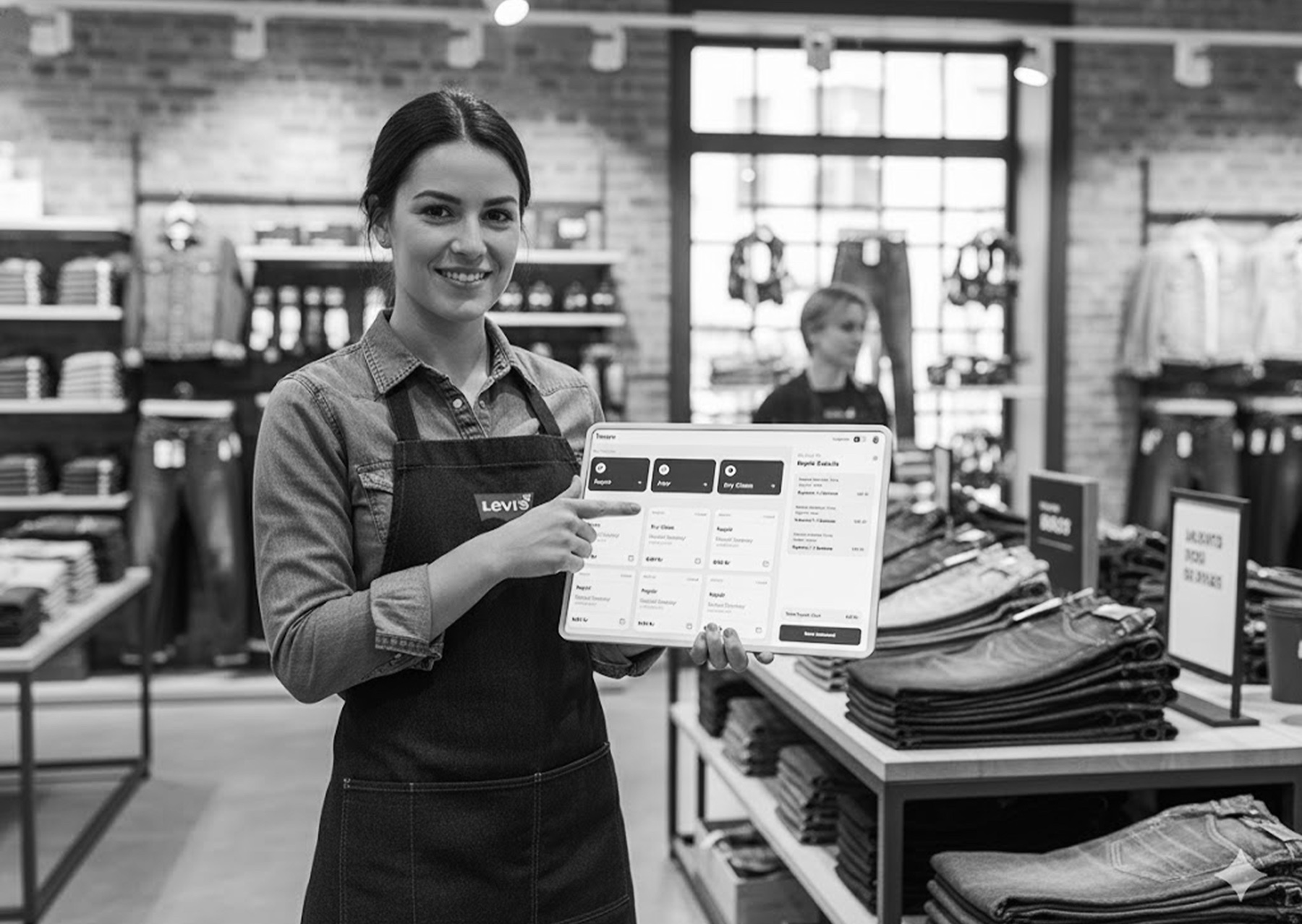
- Large targets, self-explanatory hierarchy, for staff managing stock and repairs between customers.
- Company-covered payment is a state of the order, not a separate flow.

19 · Retail · create order
The most repeated task is one form.
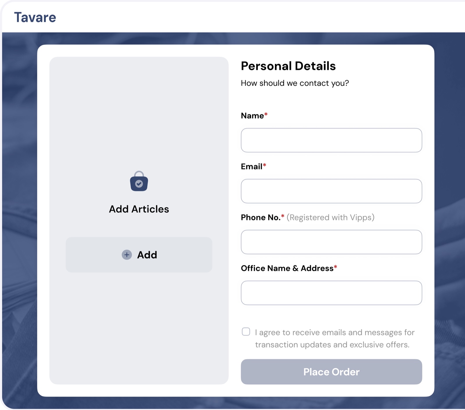
Staff log a repair while the customer waits at the counter, so the form follows the order of that conversation, top to bottom.
- CustomerName, phone, email
- ProductCategory, brand, type, competence
- DamagesPhoto, main and sub damage, price
- TotalService charge incl. VAT, then proceed
- One continuous form, not a wizard. Repeated all day, it only becomes muscle memory if its shape never changes.


20 · Repair partner portal
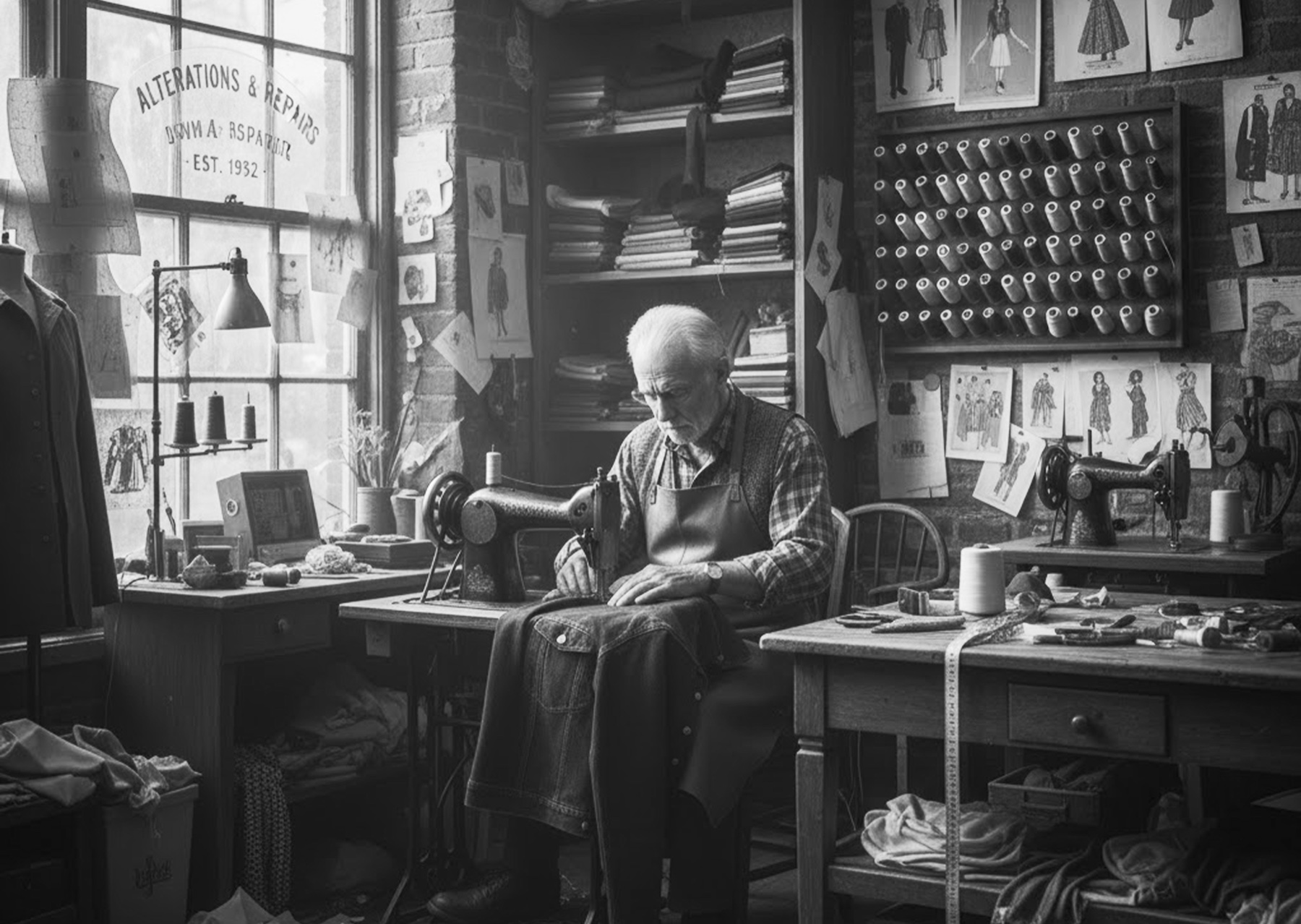
Tailors sew. The queue does the remembering.


21 · Partner portal · damage check
Less control, on purpose.
Tailors are craftspeople, not software users. The damage check is system-led: one thing at a time, with the answers offered.
- Damage is chosen from options, not typed. The note only covers what the options can't.
- The camera tells you what a good photo is: "the damage should be clearly visible".


23 · Impact & closure
Repair became the easier option.
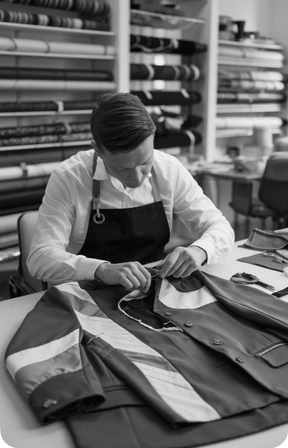
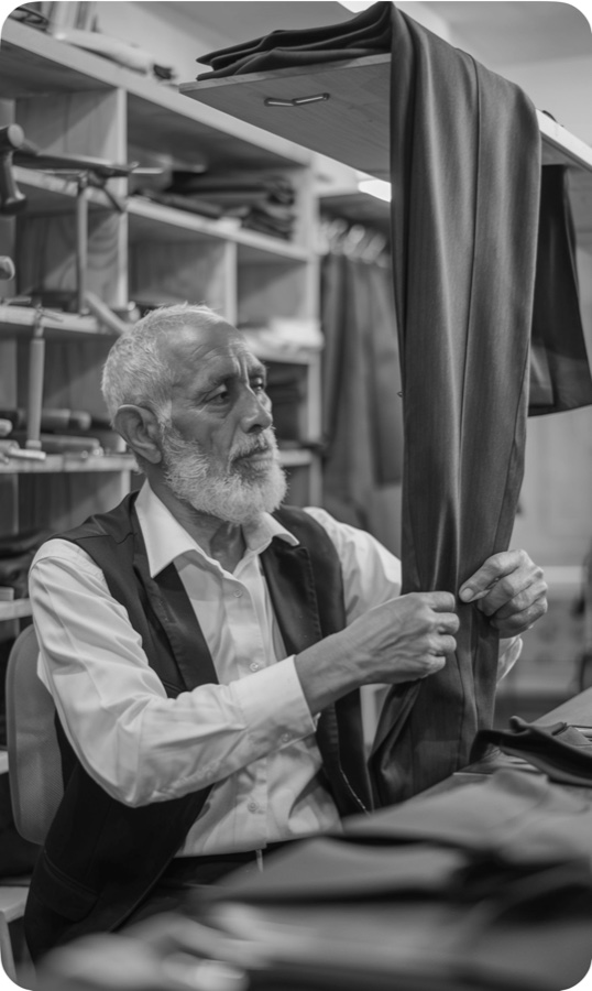
Tavare launched as one platform for every repair need. Clothes get a longer life, there's a responsible route when repair isn't possible, and independent tailors get steady work without doing their own marketing.
Every problem, closed
- No idea what options exist→One destination for warranty, paid repair and dry cleaning, with no self-diagnosis needed.
- Costs as much as new→A fixed price on every tile, plus a membership that makes the second repair cheap.
- No tailor nearby→Doorstep pickup, lockers or express. Distance stops mattering.
- Afraid of surprises→Itemised approvals with a real Skip, and a named state at every handoff.
- Tailors chasing customers→A steady, prioritised queue, with blockers printed on the card.
- Brands with no repair channel→In-store iPad intake, and company-covered payment built into the order.
Thanks for reading.Working on something this tangled? Let's talk.